Here are my steps to ensuring the handover process is as seamless as possible:
1. Include a style sheet in the design file
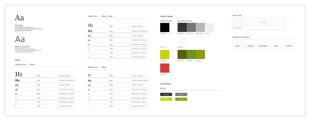
This acts as a one-stop shop reference for every style included in the design, meaning that the developer doesn’t have to trawl through the entire design looking for differences in fonts or colours. This is what I tend to include in a style sheet:
- Names of the fonts used
- Font sizes for desktop, tablet, and mobile
- Examples of the different header stylings (H1, H2, H3, etc.)
- Colours used in the design, with hex codes
- Button examples, plus hover design
- Input fields examples, such as a contact form; with required fields, placeholder text, filled field, and incorrect input
- Menu bar example with all child pages expanded
- Tablet menu
- Mobile menu

2. Provide breakpoints for mobile and tablet
Most of the time you’ll be using a standard set of breakpoints for mobile and tablet, but some designs call for features that won’t work as well beyond a certain size. This is why you need to provide breakpoints, so your tablet and mobile design come into play exactly when you need them to.
3. Using a hamburger library
Personally I don’t like the standard animation for a tablet or mobile menu button opening and closing. This is where a hamburger library comes in handy. I go through each animation, thinking about the design and the client, and pick the most suitable one. It’s then as easy as letting our front end developer know which hamburger animation I like, and the code is already there for them.
4. Have a handover meeting
It’s important that whilst designing, you’re noting down any places where a particular animation or interaction happens, or a certain element where things need to change. When you have a handover meeting with the developers to talk through the designs, you want to be able to give them the full knowledge of your idea so it’s an easier job for them, and you’re getting the result you want.
This is a good opportunity for the developers to ask any questions about the design, and for you to note down these questions in preparation for the next design handover.
5. Tablet and mobile designs
It’s estimated that 36% of the world’s population now owns a smartphone, and if you’re not designing for that, then you’re missing out.
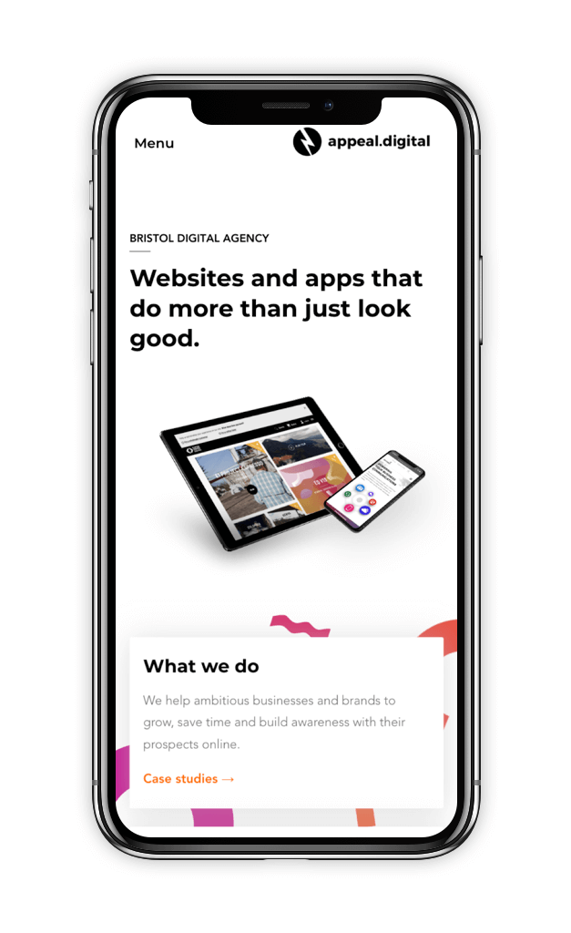
It’s incredibly important to have a responsive website, and this doesn’t just happen magically as you reduce the web page size; there has to be a design for it. If you want your website to look just as amazing on mobile as it does on desktop, then you’re going to have to provide your developers with designs.

6. Lastly, be flexible
Of course you want your website design to become a complete reality, but sometimes there are limitations. Either the client’s budget, conflicts between elements on the site, or something that simply can’t be achieved. Being flexible to come up with an alternative solution to these challenges makes developing easier, client’s happier and provides a better outcome!


