Transparency is being honest, clear, and concise in your branding, message, and content. It is important for brands to see where they lack in the transparency and make changes now before they lose those listeners that they’ve worked so hard to build.
But transparency hasn’t just been around since 2018, it has always been there. Well, at least in our personal lives. We’ve all met people that are rambly, and you can’t quite understand the point they’re trying to get across, or you get the feeling like they’re not giving you the full story. Normally after these observations, your attention sways to another conversation, or you’re left with some distrust. In marketing, this is what they are calling a lack of transparency.
Right now, people are looking to support brands that are being real with their consumers.
As a marketer, you are still allowed to be creative and tell a story, but you just need to be upfront about what the story is about before you dive into the good bits. Get to the point… then explain why.
What areas should you be looking at?
Brands should be looking at their social media channels, influencers or brand ambassadors, their website, packaging, instructional documentation, and anything else where they communicate to their consumers.
We could go on all day about what you can do to be more transparent but for this article, we’ll focus the topic on the transparency of your website.
Your website
Your website is crucial because it’s your online storefront, it’s the first impression new customers get of you. People need and want to see what you are about and how much others like you too.
There are 6 things on your website that can improve your transparency.
1. Homepage
Can a new visitor understand what you do within 3 seconds of landing on your website?
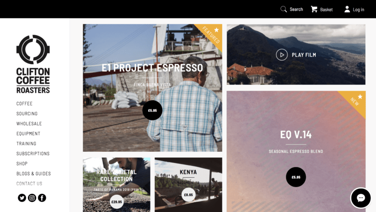
This is a combination of the messaging and visuals the user sees when first landing on your site. The popularity of having a ‘teaser’ message on the homepage is now over. People don’t like a tease. They want to know what you do!

Source: Clifton Coffee Roasters. Example of a website homepage clearly laying out their business offering without requiring a written statement.
2. Services
Are your services clearly laid out, and state what you actually do?
Some people tend to lead with the benefits, which is fine, but do not make people hunt for the ‘how you do it’ information. If they are looking for something specific and want to qualify your services, this could turn people off. Remember, people that are looking for something specific are people that are ready to buy!
Also, if you want to talk about future plans that are not implemented, you can still mention them but you need to clearly say that they are part of future plans and not yet a service.
3. Testimonials
It’s good to have a range of different reviews or testimonials that are specific to the service the customer received. They act as a mini case study that isn’t scripted to perfection because they are from a real person, just like your user.
4. Video/ imagery
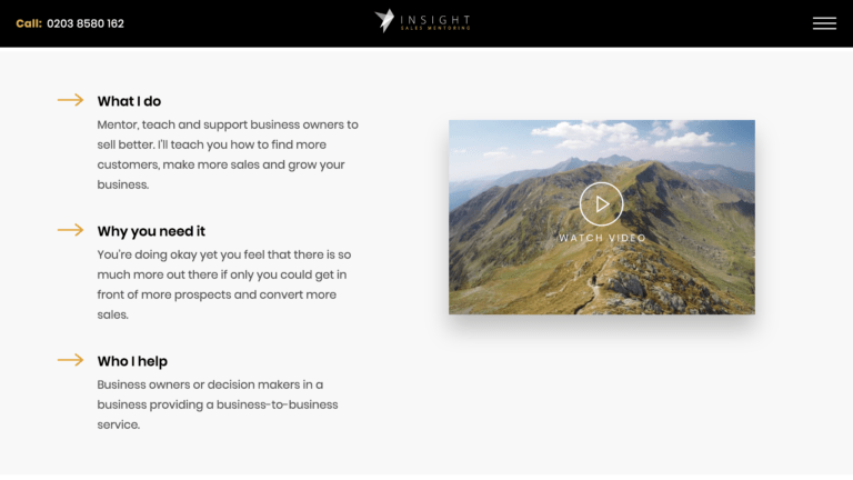
Showing what it’s like to use or work with your brand is incredibly beneficial to your business. Imagery is good, and video is better! They could be testimonials, promotional, or tutorial. Whatever you decide to do, keep in mind that it gives users transparency on how things work and who you are.

Source: Insight Sales Mentoring. An example of how video assists with explaining business services.
5. About you
This used to be a page that didn’t make much difference to a user’s journey on a site. With the transition of users buying into the brand and not just the product, the ‘about us’ page is a place where you can be fully transparent with who you are, what your values are, and what you’re providing. Take some thought and care into this page. Make it something that is worth reading, and it could retain, or have you gain some new customers.
6. Who you aren’t
You don’t need to hide all of the bad. Being transparent is also being clear on what you are not, and sometimes being clear on what you are can take care of what you are not. However, by you stating what you are not, you have the control over how you’re portrayed. Tell people first, and they won’t be upset when they hear it somewhere else.

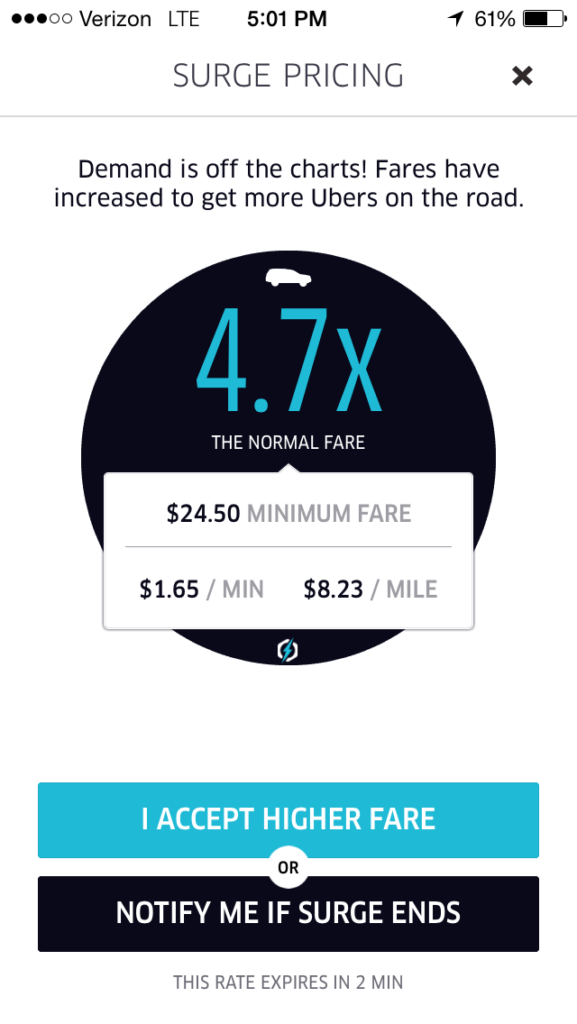
Source: Twitter. Notification to Uber customers about surge price. An example of being transparent about pricing.
Communicating honestly and clearly, in an engaging and attractive way, is a new balancing act for marketers and business owners.
If you find it difficult, have someone who doesn’t know anything about you read over your website, and see if they can get who you are in a few minutes.
Looking for some support on your website? Appeal assists with everything digital. Give us a ring or get in touch, and let’s have a chat.


